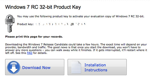
 When it comes to WordPress optimization, people often tend to neglect the benefits of the so called ‘call to cation buttons’. These are buttons, that solicit actions from your website visitors. Usually they either lead to another page of the same website, or link to a signup, sale or download.

If you have decided to create such buttons for your website, there are a few simple steps that you will need to follow. Steps, which will make these buttons much more attractive and efficient. In this article we will provide you a short guide containing a few easy steps for creating action buttons. But first – What are the main types of ‘call to action’ buttons?
- ‘Add to cart’ buttons – These buttons are very commonly used in e-commerce websites. Very typical for this type of buttons is the use of simple wordings such as ‘Add to cart’ and ‘Buy Now’ as well as the use of icons (in most cases a cart or a bag);
- ‘Download’ buttons – It is pretty clear what these buttons are all about;
- ‘Learn More’ buttons – Such buttons are usually linked to another page of the same website, tempting visitors to look for some further information on the topic they are interested in;
- ‘Signup’ buttons – Once again, the title explains their main functions.
Of course, there are plenty of other types of ‘call to action’ buttons, but these four are considered as the most common ones. So, if you want to optimize your website by adding such buttons to its overall layout, the first thing that you will have to do is consider the best type for you. Are you trying to sell your products? Do you offer some other type of web services, that require a website registration? All this matters when it comes to creating ‘call to action’ buttons.
Tips on how to create effective ‘call to action’ buttons!
1. Make it big!

The size of your call to action button has to be considered very carefully. It has to be notable and big (in fact, the biggest on the webpage). However, be careful not to overcrowd the page. Otherwise you will achieve just the opposite effect.
2.
Make it colourful
The colour of the button is another very important thing. It has to stand by so perhaps the best solution is to choose some contrasting colour to the background. Of course, you will have to consider it according to the overall colour scheme of the page. Otherwise it can spoil its good look.
3.
Keep it clear and simple
Once you have chosen the basic colour and size characteristics of your ‘call to action’ button, you will have to consider the word (or phrase) that you will place inside of them. Remember – simplicity is the key to success. Try to choose something, which will be both attractive to your visitors and will give them enough information.
4.
Whitespace

This is our last tip. Whitespace is an essential element when comes to making your button notable. Especially if it is small or pale coloured. It works as a frame for the eyes, separating the button from the main colour of the background.
 Author Bio: Rose Finchley is passionate freelance blogger keen on topics about technologies, Internet and blogging. She currently maintains the site of Sparklingcarpets and she loves her love.


Yes, make them click the button with big button and colorful, great idea Rose!